Graphite, Charcoal and Ink: Three Drawing Media and Their Looks
How different traditional media create different moods, and how to choose a sketch style for your photo.
Traditional artists choose their medium for the mood it creates. Knowing the differences helps you pick the sketch look that suits a photo.
Graphite (pencil)
Graphite is the familiar grey of pencil.
- Look: soft greys, fine detail, subtle shading.
- Mood: delicate, precise, quiet.
- Good for: portraits, still life, detailed architecture.
Charcoal
Charcoal is made from burnt wood.
- Look: deep, velvety blacks, smudgy edges, dramatic contrast.
- Mood: bold, expressive, moody.
- Good for: dramatic portraits, landscapes, strong light and shadow.
Ink
Ink can be drawn with a pen or brush.
- Look: crisp black lines, high contrast, no soft greys unless diluted.
- Mood: graphic, sharp, clean.
- Good for: comics, illustrations, architecture, bold outlines.
Coloured pencil and pastel
- Coloured pencil: delicate colour built up in layers.
- Pastel: rich, powdery colour with a soft feel.
- Marker: flat, vivid colour.
Comparison
| Medium | Lines | Tones | Feel |
|---|---|---|---|
| Graphite | fine | subtle greys | delicate |
| Charcoal | thick, soft | deep blacks | dramatic |
| Ink | crisp | stark contrast | graphic |
| Coloured pencil | fine | layered colour | gentle |
Matching a photo to a look
| Photo | Try |
|---|---|
| Gentle portrait in soft light | a pencil-like effect |
| Strong shadows, dramatic sky | a charcoal-like effect |
| Buildings with clear edges | an ink or line-art effect |
| Colourful scene | a coloured-pencil or colour sketch effect |
Why the choice matters
The same photo can feel calm in pencil and intense in charcoal. Try several looks, and compare the mood.
Paper matters too
Real drawings depend on the paper: smooth paper for fine detail, rough paper for textured marks. Some effects add a paper-like background for a hand-made feel.
A quick experiment
Pick one photo and apply a few different effects. Look at each on your phone screen, and choose the one that matches how you want the picture to feel.
Learning more
Looking at real drawings, in books or galleries, trains your eye. You'll start to see which effects feel natural and which look artificial.
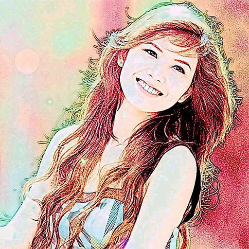
Color Photo Sketch
Turn your photos into sketch and art-style effects in one tap
More about Color Photo Sketch
Hatching and Cross-Hatching: How Artists Build Shadow with Lines
The classic line-based shading techniques and how to recognise their look in sketch and engraving-style photo effects.
Read article →Lighting a Portrait So It Becomes a Striking Sketch
How the direction and softness of light affect a portrait, and simple lighting setups that convert into strong sketch results.
Read article →Line, Tone and Texture: The Three Building Blocks of Any Sketch
A beginner's guide to the elements that make a sketch look like a sketch, and how to spot them in a sketch-style photo.
Read article →Pencil Grades Explained: From HB to 8B and What They Look Like
How the pencil grading scale works, what each grade is good for, and why sketch effects often mimic these looks.
Read article →