Avoiding Over-Processing: Why Less Can Look More Like Art
How to recognise when an effect or edit has gone too far, and how to keep results natural and pleasing.
It's easy to keep tweaking until a picture looks strange. Knowing when to stop makes the difference between charming and garish.
Signs of over-processing
- Harsh outlines that look like scratches.
- Blotchy or smeared areas.
- Lost faces: features flattened or distorted.
- Unnatural colours: neon skin, glowing skies.
- Heavy texture overpowering the subject.
- Loss of the subject's identity: the person no longer looks like themselves.
Why it happens
- Strong settings applied at full intensity.
- Stacking effects, one on top of another.
- Starting from a poor photo and trying to rescue it.
- Editing on a bright or dim screen that hides problems.
Principles
- Start from a good photo. Effects can't fix blur or poor light.
- Use one main effect. More isn't better.
- Keep intensity moderate, if the app allows adjustments.
- Check faces closely. They're where problems show first.
- Step away, then return with fresh eyes.
The 100% and small views
- Zoom in to check details.
- View small to check the overall look.
Good results work at both sizes.
Compare with the original
Look back and forth. Does the effect add something, or just change it? Sometimes the original is better, and that's fine.
Simple edits first
Before applying an effect, make basic corrections: crop, straighten and adjust brightness slightly. Then let the effect do its job.
Know when to stop
If you've made three versions and none seems right, the problem is probably the photo. Choose another and start again.
Trust your first reaction
If your first response to a result is "That looks great", it probably does. If you find yourself making excuses for it, try something else.
Balance
Sketch effects are best when they enhance a picture's qualities: shape, light and mood. When they overwhelm it, dial back.
Tip
When in doubt, choose the subtler option.
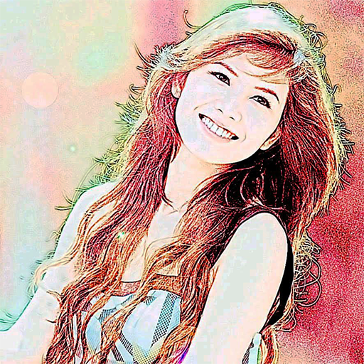
Color Photo Sketch
Turn your photos into sketch and art-style effects in one tap
More about Color Photo Sketch
Comparing Effects: How to Choose the Best Result for a Photo
A simple method for trying several sketch effects on one picture and judging which one works best.
Read article →Cropping Before You Sketch: Portrait, Landscape and Square Choices
How the shape of your crop affects a sketch effect, with tips on framing faces, scenes and objects before applying it.
Read article →Keeping Originals and Sketch Versions Together: A Simple Filing System
How to name and store original photos and their sketch-style versions so nothing gets overwritten or lost.
Read article →Sharing Sketched Photos of Other People: Privacy and Consent
Why a sketch effect doesn't remove privacy concerns, and how to ask permission and share respectfully.
Read article →